01 The situation
Early-career employees are constantly told to find purpose at work, but they aren't given the tools to actually do it. Data shows that over 70% of people define their purpose through their career, yet only 15% are living it daily. The real problem isn't a lack of motivation. The problem is that senior leaders rarely open up and admit that they used to be lost, too.
02 My approach
I managed this project from start to finish, including the background research, creating both prototypes, running the tests, and making the strategic decision to transition away from my initial design concepts.
Psychological theory points to three basic human needs for internal motivation: feeling capable, having control, and feeling connected. Building a big portal feels like an easy way to check all three boxes at once, so that is what I built first.
But my core theory was much simpler: if young employees can watch short, casual, and honest videos of senior leaders talking about their own struggles to find purpose, they will feel validated. That validation is what gives them the confidence to start looking for their own 'why'.
When you look at it that way, you realize what you don't need. You don't need a profile page or a wellness calendar. The magic comes from one person being completely honest on camera. Everything else in my first design was just extra infrastructure built around an untested guess.
03 Key decisions
Here are the choices I faced and the calls I made along the way.
-
The tension
The big system vs. a small slice. The theory supports a big portal with lots of features, and each feature makes sense on paper.
My callBuild the cheapest piece first.
The real reasonIf a three-minute video can't move someone, an expensive portal won't save it. It's better to spend three days finding that out than six months.
-
The tension
High production vs. casual video. High-quality video looks professional, while rough video can look accidental or un-serious.
My callKeep it rough.
The real reasonBeing casual and unpolished was the design. The moment a video looks highly produced, it feels like a corporate ad instead of a real person telling the truth.
-
The tension
Testing with proxies. My test group was made of graduate students, not corporate employees, but the theory is meant for real workplaces.
My callTest anyway, and be honest about it.
The real reasonIt is much better to get a clear directional signal from 15 proxies than to build an entire platform based on zero real feedback.
-
The tension
Optional resources. In a real workplace, optional tools often get completely ignored when people get busy.
My callLeave it unresolved for now.
The real reasonI chose to leave this as an open question in my final findings. Inventing a fake answer during a small test would have been dishonest.
The hardest call
Moving past my initial prototype. I had designed four great features and storyboarded all the screens. They looked good. But the user tests proved that all the actual value lived in just three minutes of video. The rest of the portal was just scaffolding I built to make myself feel comfortable. Knowing when to step back from complex elements because the data points to a simpler path is the part of this project I am most proud of.
04 What I built
I created two different versions, and the one I kept was much smaller.
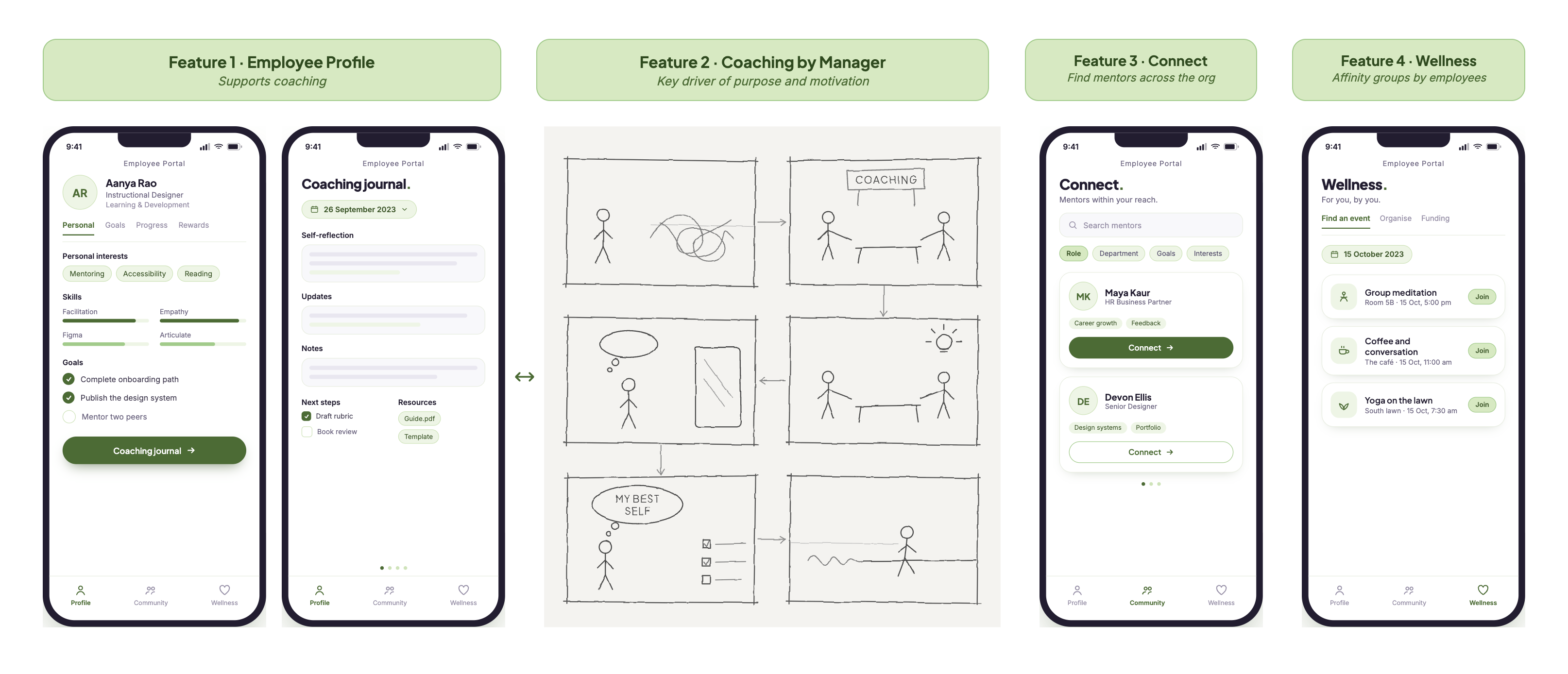
MVP #1, the portal. This was a full digital platform storyboarded down to the screen level. It included employee profiles, a coaching journal, a mentoring network to connect across departments, and employee-led wellness groups.
MVP #2, the video. A senior leader talking about his non-linear path to finding purpose. It lasted three minutes, had no script, no background music, and was shot in a single take. The simple style wasn't because of a low budget; it was a deliberate design choice. Any extra polish would have made it feel less authentic, and authenticity was the entire engine of the project.
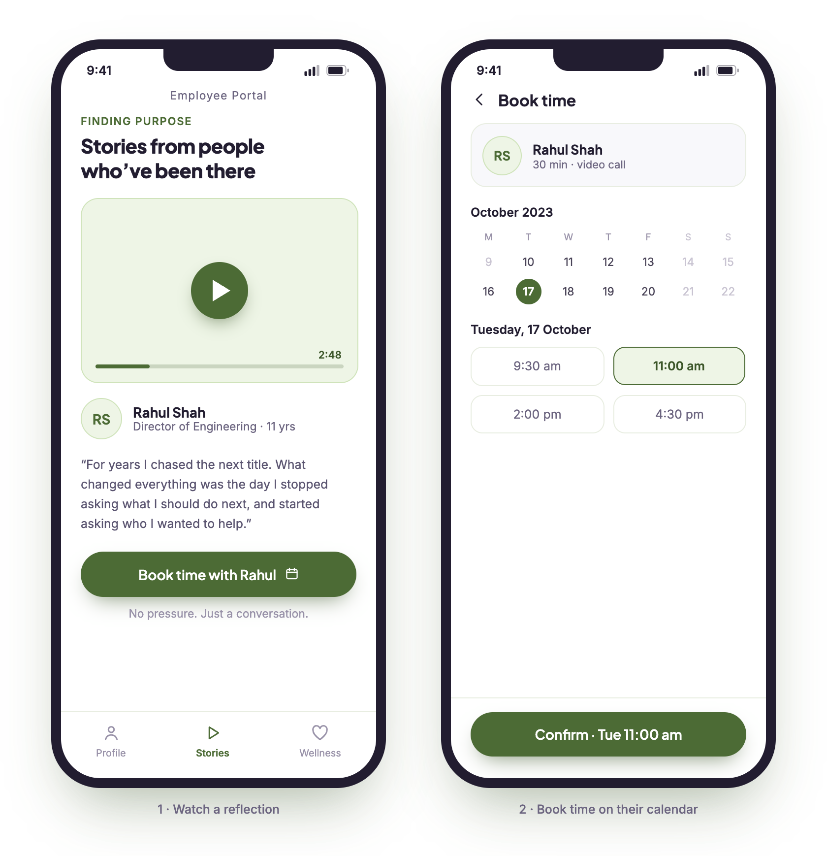
The video itself stays private, out of respect for the person who agreed to be candid on camera for a research prototype rather than for my portfolio.
A note on the visuals: the 2023 originals were rough storyboards and the video itself. I rebuilt the portal mockups you see here with Claude Design so the concept reads clearly on the page. The tools sped up the redraw. The research, the theory of action, and the decision to narrow the focus stayed mine.
05 The outcome
I tested the video prototype with 15 early-career learners over Zoom, and I tracked what they said as well as what they did after the session ended.
What people did
What people said
Reading between the lines
A perfect score sounds great, but total agreement usually means the sample was small or people were just being polite. I treat these numbers as a sign that there were no major red flags, not as definitive proof. The number I trust the most is the 5 people who stayed late. Unprompted action is the best data point you can get.
The most practical takeaway was small: two people said they wouldn't reach out to a leader without a specific reason or context. That is an easy design fix for the next version: a simple one-line conversation starter would bridge that gap.
06 Reflection
What I'm taking with me.
- The power of the cut. My natural instinct was to design a massive system, but a system was the wrong scale for the problem. It was a lot of features built on top of a guess. Now, my standard approach is to test the smallest, most honest version of an idea first, rather than saving testing for the very end.
- The engagement dilemma. Getting volunteers to watch a video during a structured test proves the content is good. It doesn't prove an employee overwhelmed with work will click it on a busy afternoon. Making the right choice the easy choice in a busy environment is a much tougher design challenge, and it's the one I want to tackle next.